Is It Time For a Website Redesign?
Have you ever heard the phrase, “Aging gracefully?”
While I personally think that aging gracefully is a virtue, I can tell you one place where age really does matter: your website. After just a few years, even the most cutting-edge, beautiful, and well-designed website starts to look a little dated, or even worse, doesn’t function properly anymore! In fact, many websites look like they’ve gone without any updates for over a decade!
Although, to be 100% honest, there are far fewer of them than there used to be. Over the last few months, COVID-19 has pivoted millions of small businesses to an online-first mindset. It’s only natural when your physical storefront is closed in a shutdown. Because of this, companies have been spending time to update, upgrade, or completely redesign their websites. The result has been some spectacularly well-designed sites driving a ton of new traffic to their businesses!
Personally, I think it’s the perfect time to do some rebranding by entirely rebuilding your website. Heck, if I didn’t update my own site fairly recently, I would be doing the same! And I’ve been auditing, redesigning and rewriting copy for a ton of websites this year! If you want to expand your online presence, safeguarding your small business in the event of another shutdown, then doing a website redesign is an absolute must!
So Do You Want to Do It Yourself?
“Drag and drop” website building services like Wix or Weebly promise that folks can save money by building their own websites. They use drag and drop interfaces and web page templates to make website building “easy.” The problem is that building a website ISN’T easy.
At a glance, doing a redesign of your website using a DIY option might seem far cheaper. But that cost can catch up with you. When confronted with two different companies’ websites, the chances are that a potential customer will go with the more engaging, attractive, and functional one. In other words, they will likely choose the website not built on an overused template. Customers are savvy and they not only love a great UX (user experience) they also love a website that is beautifully designed with story-driven copy!
On top of that, if you have no experience building websites, you may not know how all of the pieces should fit together. You may not know which pages should be text-heavy and which should be graphically intensive. And there are a lot of third party services that will need to be integrated with the website including email marketing, social media, podcast players, the list goes on and on. These are things that you can only learn through extensive study or experience.
Now, this isn’t slamming the services themselves. Website platforms like Squarespace offer user-friendly website building tools that can create functional websites, no question. But here is a secret: the incredibly polished websites built using DIY website tools are, more often than not, made by professionals.
Yes, those professionals may be using the DIY website services’ tools, but they know how to use them at a very advanced level. An experienced virtual assistant can take the tools provided by WordPress or SquareSpace and create a website that no one would believe was done with DIY tools!
Take a Tour
So, where do you start with a website redesign? Well, how long has it been since you’ve navigated your own website?
Most people go through everything once the site is complete, then rarely do it again. But taking a quick tour is one of the essential parts of offering your online customers a fantastic user experience. Doing so is called a website audit.
Starting with your homepage, click around the site, checking out pages to see if they flow into each other logically. Don’t deeply analyze everything; just try to take in the general user experience. After you’ve finished, you will have a sense of just how much needs to change for your website redesign.
Look at the Homepage
If a website were a body, the homepage would be the face.
Your homepage is the first thing that a person sees when they click on your website on Google. If it doesn’t make a good impression, you’re dead in the water.
Your homepage should do a few things right off the bat, like:
- Display the name and logo of your company.
- Tell viewers who you are, what you do and how that benefits them (quickly)
- Share your unique selling proposition.
- Offer a lead magnet to start people down your email marketing and product funnels.
- Provide your ONE call to action above the fold.
It All Starts with Branding & Logo Design
If you don’t have an attractive and engaging logo for your company, prominently positioned on your website, you’re already falling behind.
An appealing logo needs to do more than tell people the name of your business. It must communicate your entire brand through colors, design, and graphics. This logo should always be prominently positioned at the top of every page.
Not having a compelling and professionally designed logo is a common mistake with a lot of small businesses. There are more important things to spend money on, right? Not so fast. Your logo is a visual representation of your business. If it looks sloppy or poorly designed, that reflects directly on you, especially when it comes to your website.
If you’re looking to reboot your branding for 2021, then having new branding and a new logo design can be an eye-catching option. Even if you are in love with your current logo, there is no reason why you couldn’t ask a graphic designer experienced in marketing to do a quick polish on it.
Website Navigation
The navbar is where the viewer of your website will click to navigate to different pages. I’ve personally found that simpler is better when it comes to navbars. You don’t want one that has clutter or has a load of drop-down menus.
When designing a website, I like to start with these five pages: About, Services, Blog, Testimonials, Contact Us. Then I expand or subtract pages, depending on the services that you are offering. It’s easy when you know how!
For a website audit, the navbar is my first stop. I want to discover how the website “flows.” If it’s off, I look for places where I could simplify the experience by merging redundant copy, repairing links, or cutting unnecessary pages.
A website redesign is about far more than making visually attractive pages. You need to think about how your audience will navigate through it. If there are dead-end links, a confusing navbar, out-of-date landing pages, and tons of redundant information, your audience is going to lose interest fast and go elsewhere.
Sum Up Your Business
In newspapers, there is a concept called “above the fold.” All of the most important stories are above where the paper folds in half. The same concept applies to your website. The first visible section of your homepage should sum everything up about you and your business, including compelling copy about your unique selling proposition.
Summing up all aspects of your business in a single one-liner without it becoming bloated/super long is tricky. It gets even trickier to structure that one-liner in a way that will directly appeal to your audience.
Get Them to Scroll Down
All of these elements I’ve been talking about should come together to compel site visitors to take that ONE call to action you want them to take. After all, the whole point of a website is to get someone to do something!
Calls-to-Action
Everything on your website, from the color scheme down to the copy, needs to be a design to get your viewer to continue exploring your site, consuming your content, and hopefully becoming a customer.
Without a variety of CTAs, how will your customers know what you want them to do? A call-to-action can be as simple as “Click Here,” but my advice would be to write something a little more engaging. Rather than use generic phrases like “Sign Up” or “Find Out More,” I might use more interesting CTAs like “Register For A Life-Changing Experience!”
Other places you want to put calls-to-action are on your homepage’s free opt-in (inside a pop-up is an excellent choice for this), every product page, and at the end of every blog. And don’t forget to put a great CTA on your contact page, as that’s the last place people are likely to visit on your site!
Functionality
Designing a slick and modern website is a moving target. With new features and technology on the horizon at all times, you need to make sure that your website isn’t falling behind.
A great example of this is finding out if your site is mobile-optimized. So many people primarily use the internet on their devices today. If your website isn’t optimized to fit correctly on that smaller sized screen while still offering all of your full site’s functionality, you will be missing out on those mobile loving customers. Today, WordPress and similar services usually build this feature into their sites, but it’s important to make sure that yours genuinely looks good on a phone or tablet. It’s a sometimes-overlooked, but vital, aspect of any website redesign.
Webcopy
If you’re going to be redesigning your entire site, you will want to do a rewrite of your webcopy.
Writing copy for a website is a specialized skill. It needs to effectively support all of the graphic design choices that have been made for the site while also communicating detailed information about your business and services. It should be punchy, engaging, personality-infused, story driven, full of CTAs (both explicit and subtle), and SHORT. Trust me, if someone comes upon a website that looks more like a college midterm paper than a landing page, they’re going to be clicking off it FAST.
And if you’re going to be rewriting your webcopy, it’s also a fantastic time to boost your SEO! Search engine optimization is how Google and other search engines find your site. Depending on whether SEO on your website is good or bad, Google will either shoot you to the top of the results or bury you under hundreds of your competitors.
If you think that SEO means shoving as many keywords into your copy as possible to fool search engines into promoting your site, that would be a solid no! This strategy not only results in an awkward, difficult-to-read copy, but it is also actively punishable by Google. You should avoid keyword stuffing at all costs! Do you keyword research and then organically sprinkle them in.
So, What Did We Learn About A Website Redesign?
Let’s review what we learned:
- Now is the perfect time to consider redesigning your website.
- Always do a website audit before making any significant changes to your site.
- Your homepage is the first thing that visitors see. It’s the “store window” or “face” of your business.
- Your logo should be on every page and communicate your entire brand at a glance.
- Your navbar needs to be uncluttered and logical. Think UX (user experience).
- Keep the most important information about your business “above the fold.”
- Always include calls-to-action throughout.
- Make sure your website supports the latest functionality. If it isn’t mobile friendly, you must update immediately!
- Webcopy needs to be short, engaging, and optimized for search engines.
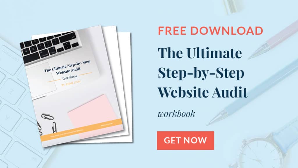
Doing website audits and redesigns is actually one of my favorite parts of being a virtual assistant. I love helping people learn which section of their website works and which need a revamp. If you’d like to learn more about how to do your own website audit to start redesigning your site, you will love my free download The Ultimate Step-by-Step Website Audit Workbook. It will get you rolling!
Rebuilding a website is not something to be done in your spare time. If other things are on your plate, a redesign can move to the backburner in a hurry! That’s one reason why I highly suggest hiring a professional who can give your website redesign all of their attention! If you’d like to talk about how I can entirely reboot your website for 2021, please contact me today for a free consultation!
Links For This Episode:
- The Ultimate Step-by-Step Website Audit Workbook
- Seed Keywords, Sowing the Seeds for your Website’s SEO Success
Rate, Review, & Subscribe on Apple Podcasts
If you like what you hear on the podcast, please consider rating and reviewing my show! Woo Hoo! Click here, scroll to the bottom, tap to rate with five stars, and select “Write a Review.” I would love to hear what episodes you enjoy the most!If you haven’t done so already, please subscribe to the podcast. I’ll be adding new content weekly, if you’re not subscribed, there’s a good chance you’ll miss out. Subscribe now!